Dear Reader (2019-11-13),
Though I had been thinking of photography, I hadn’t actually been out there with my camera for too long. On Monday, photography began later than originally envisaged. But, I did get out. That was a good and needed thing. When I started driving, my mind was blank of ideas and imagined images. For the next 3 / 4 (or maybe it was 5) hours I drove 4 sides of a rectangle out NE of Strathmore. The drive was filled with a multitude of U turns and reverses.
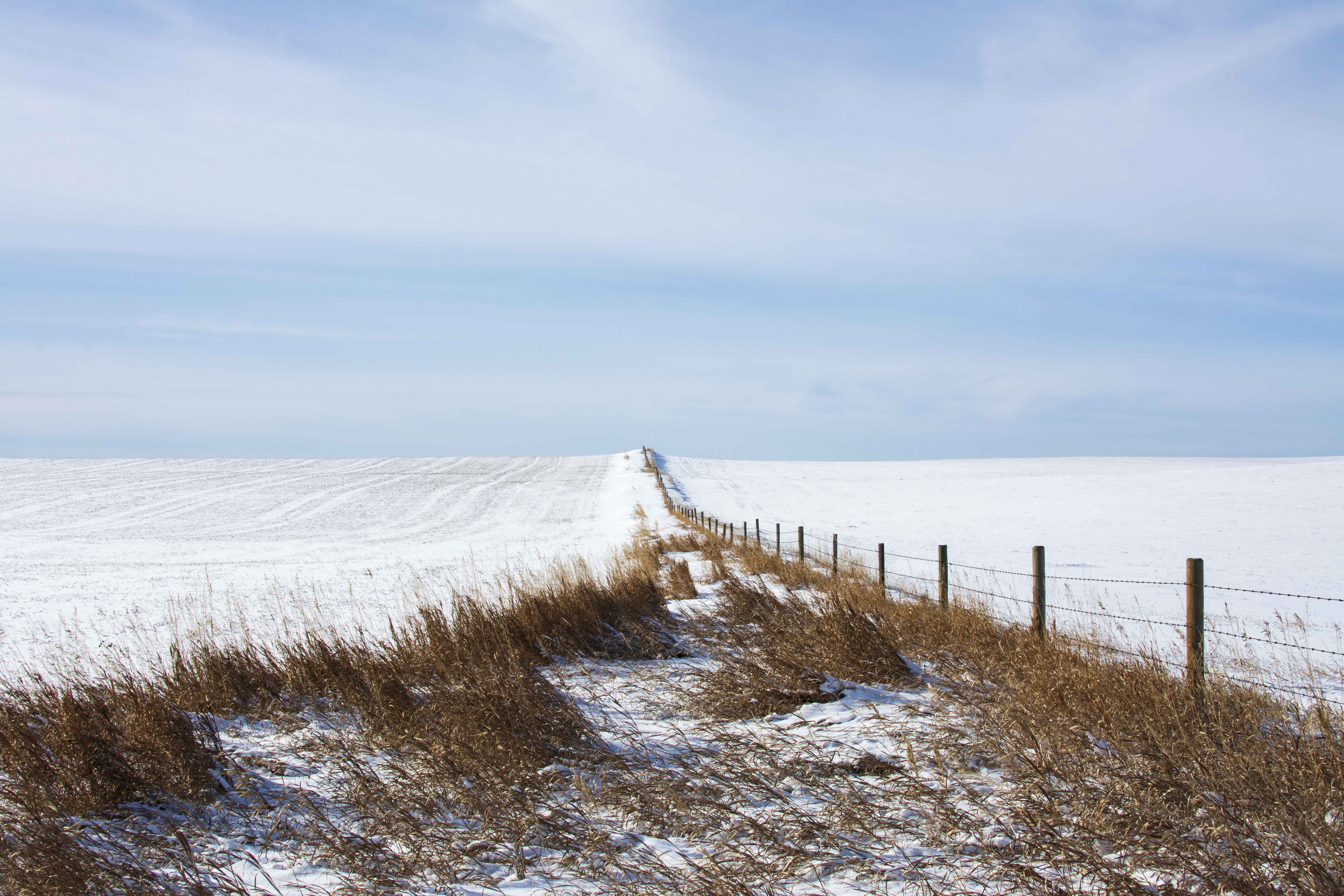
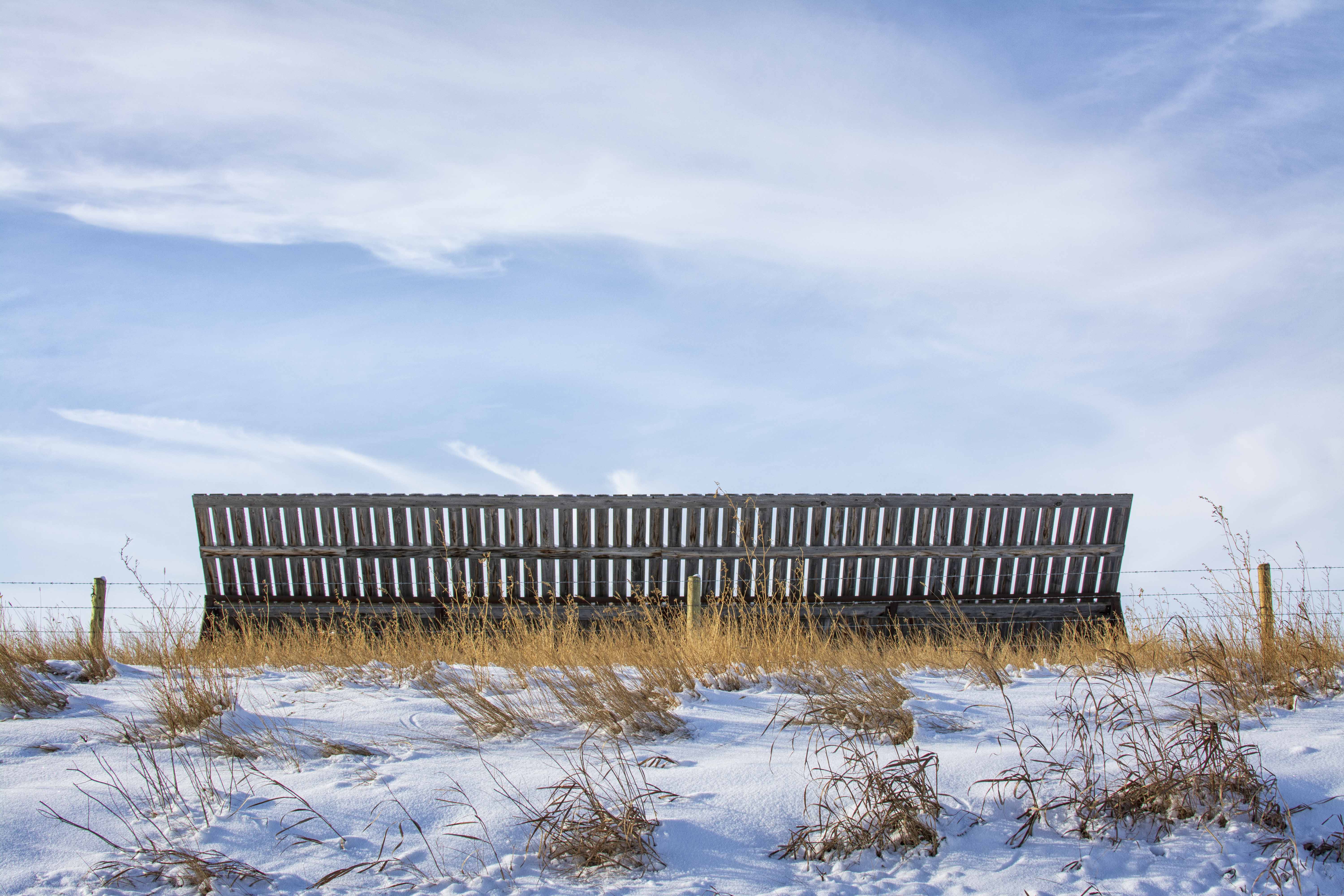
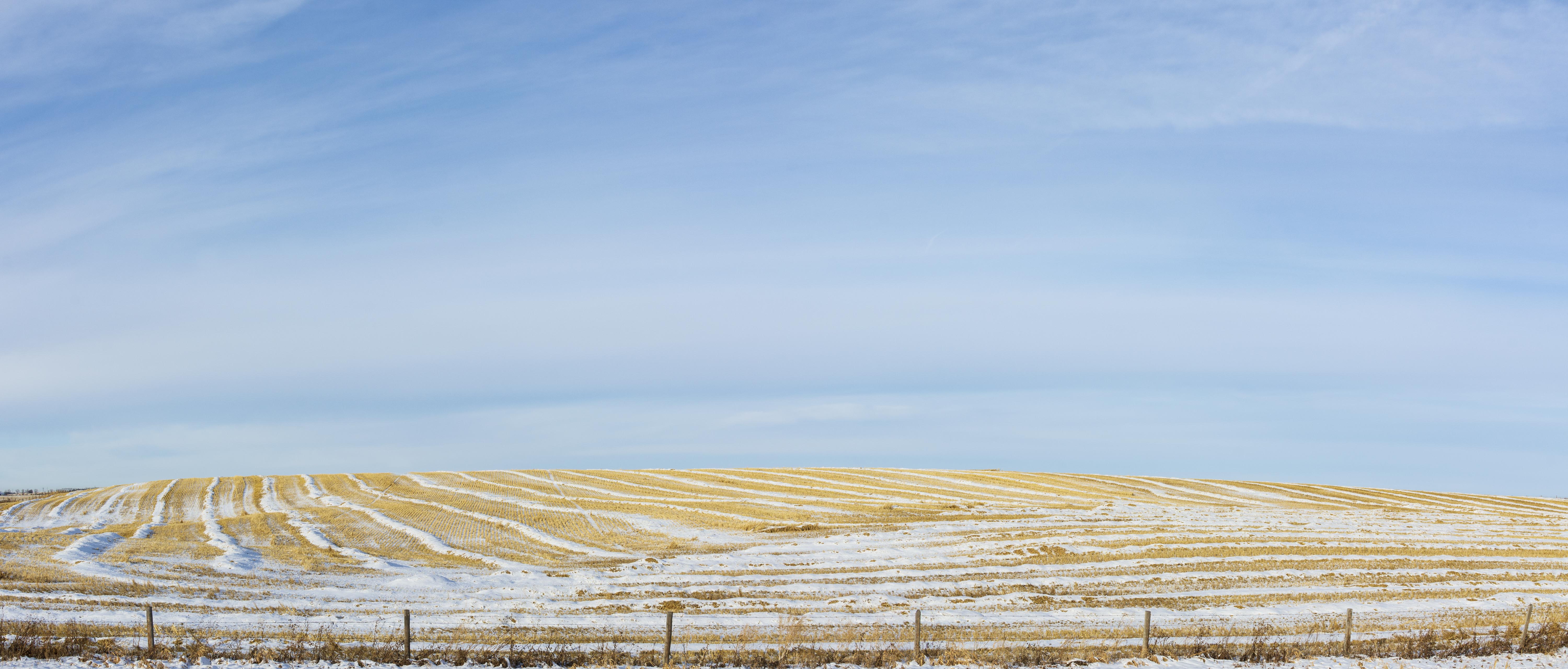
Content as I was, emotionally I wasn’t sure where I was going, what I was doing, or even what I had. I did think there were some new additions to a series that is not yet ready for prime time. It wasn’t until the day’s collection was in post that I discovered there were quiet successes. Despite those successes I remain unsure of many of the images in today’s collection. For instance, photo 4 (16 x9) and 5 (pano) are taken from the nearly identical spot. Does one work better than other (based on any criteria that comes to mind or heart)? Again, what about 6 and 7? I really like 8 and 9 might be a 5 (too early to tell). 10 is a nearly (nearly good but is probably a 3). The fence is too close to the bottom edge and the left side is cut-off. The result is the whole image feels cramped.
As always, I invite your comments, especially given my above indecisiveness. Also as usual, this set will work better on a monitor than a phone.
Cheers, Sean



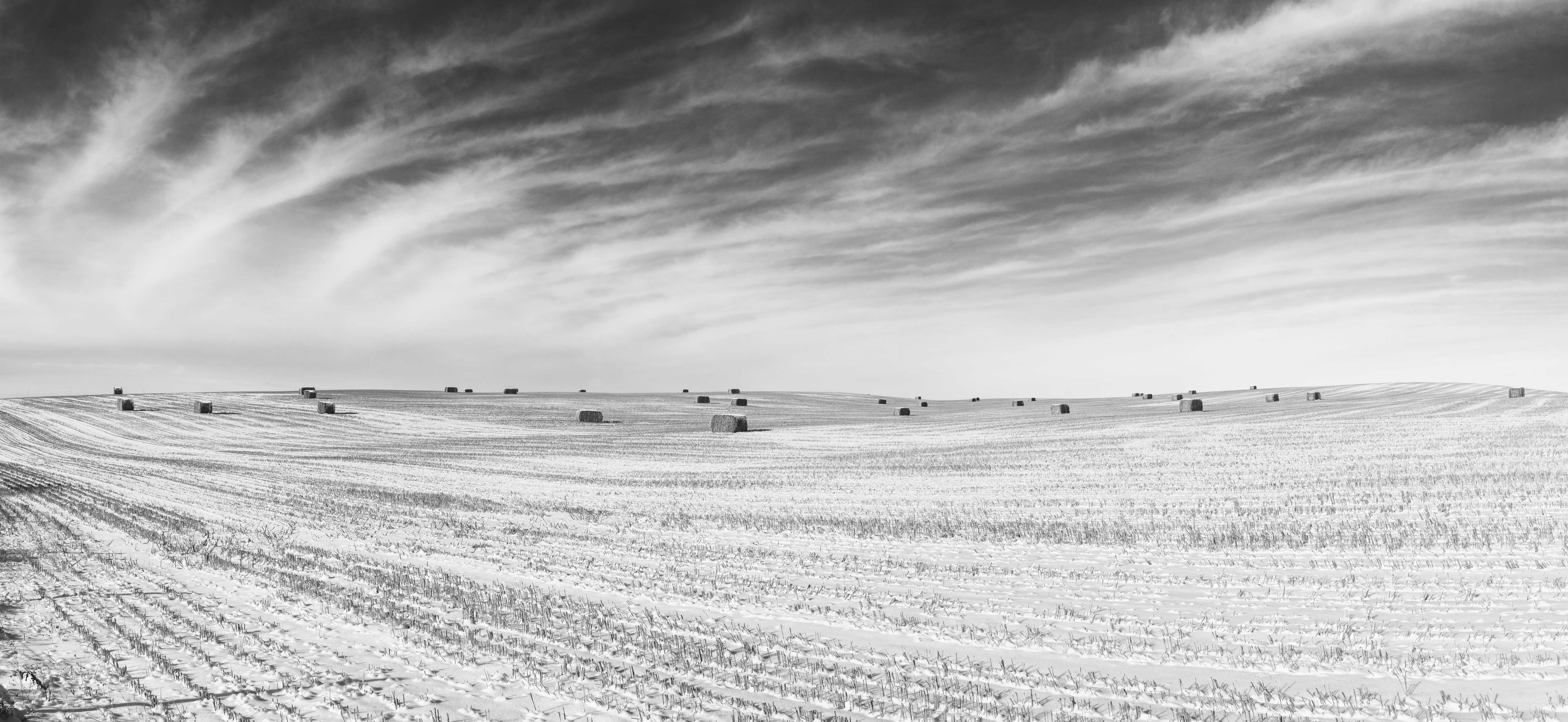
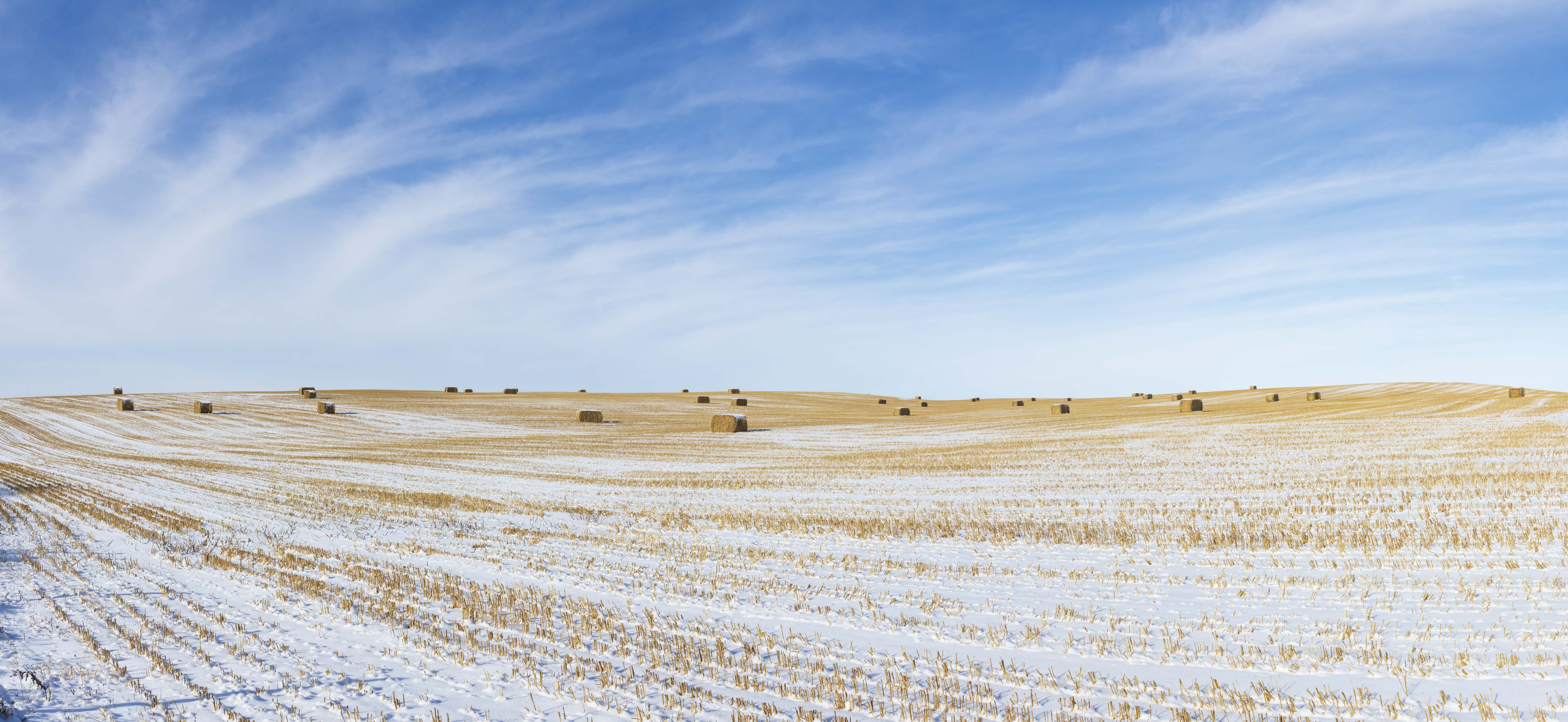
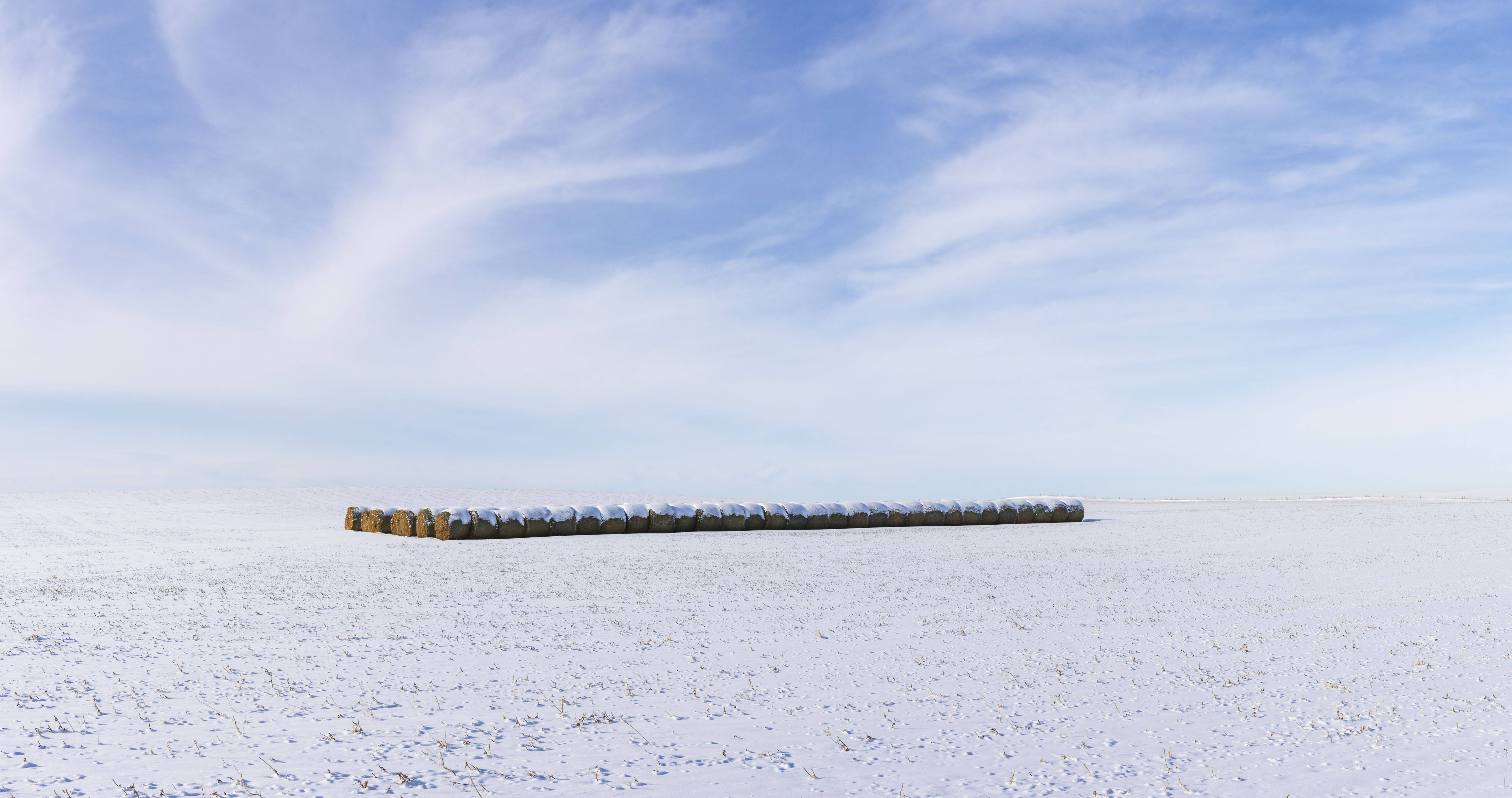
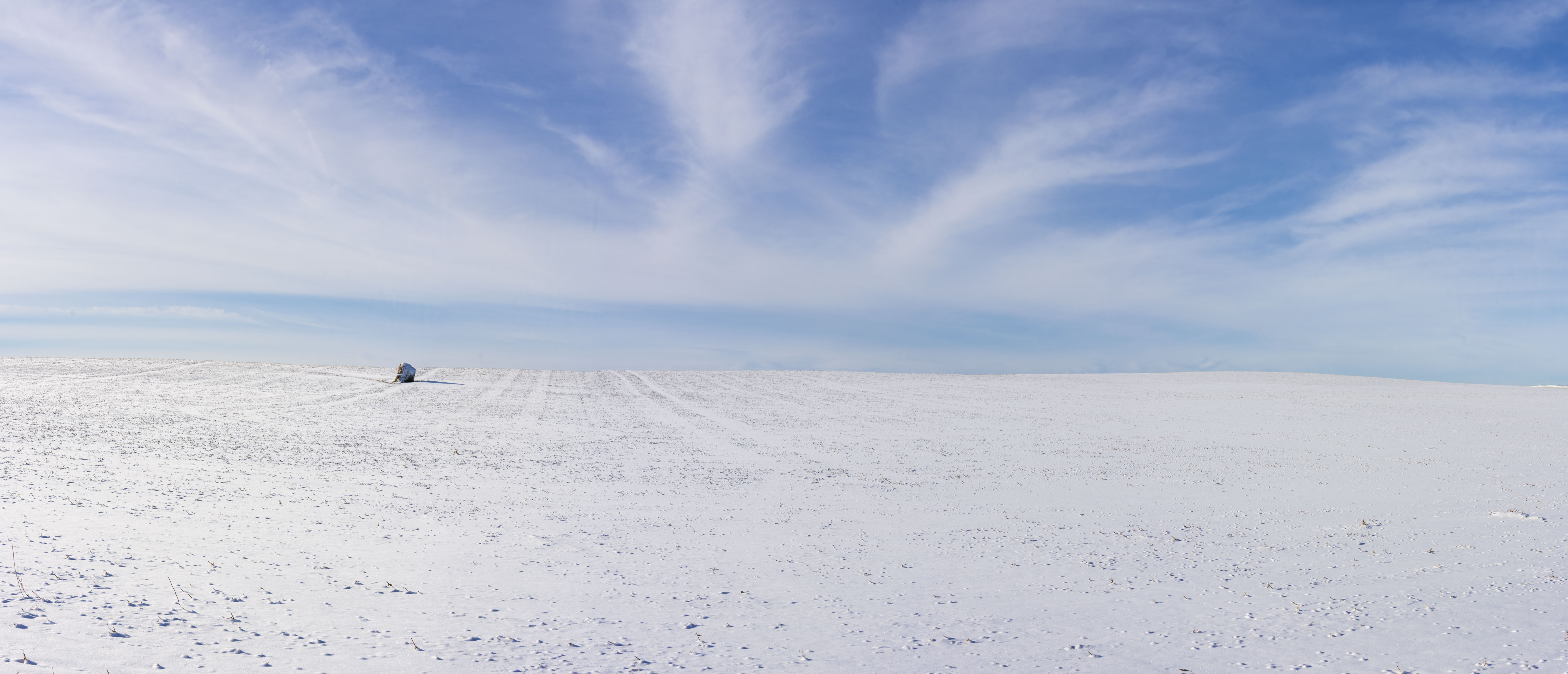
I really like the B&W and have to say that #9 is my favorite. Nice job though with all of these. As to which of the pano or 16×9 strike be more than the other I have to say the pano gives me a stonger feeling of the expansiveness of a winter field.
Thank you for visiting and commenting. It is always a pleasure to hear from a new commentator. Cheers, Sean
Here we go, browser window set to full desktop size. Once again, the browser has jumbled the order, a major detraction of a blog as an image presentation platform.
Starting with the drive, I find that heading out without a place to go, or at least some idea of what I want to shoot, often leads to being disappointed in the photographic outcome. Not always, because sometimes serendipity happens. But there is a fine line between an aimless wander looking for any image, looking for a particular image while being open to other possibilities, and being so locked into the desired image that everything else is overlooked. I’m still working on this.
1- I am pleased with this one. The subject suits the panorama format. There is a nice contrast between the red (but not too much or too bright a red) of the building, and the blue of the sky, complete with some trees to add interest to the transition.
3-the windbreak is a similar idea. It’s nicely composed, balanced, all those good things. And yet somehow it doesn’t do anything for me. The barn had me wondering what was in (or had been in) it, if the paint had peeled off from age or it was graffiti painted over. The image isn’t perfectly symmetrical. Maybe 3 is too symmetrical.
2-Remember where this spot is! I like the composition of the fence and and shrub and horizon. But my eye follows the fence like a rocket and ends up in the sky, asking itself, what just happened there. I think if there were some snowdrifts along the fence, and the sky had some drama to it (you know I’m a big fan of sky drama) the eye would wander along the fence. I think this, as is, is one that that might need other similar work around it, and would be stronger as a group.
4 and 5-How inconsiderate of the landowner not to leave a third muffet in just the right foreground place to form a nice triangle! Back and forth several times, and I think I land on somewhat preferring the pano version. Why? Subtle things, and I think it comes down to the tracks on the left side, and being able to see a bit more of the sky.
6 and 7-This may surprise you, but I prefer the B&W version because it brings out more of the subtle detail in the clouds. I love the straw stubble, and big bales, but I still get the texture and flow of it in the B&W version.
8-(The muffets all herded together for self protection, or have been quarantined from the rest of the herd.) I like it, and wonder how it would look in B&W for the same reasons as 6 and 7.
9-Loving it!
10-Doesn’t do much for me. I think it’s too symmetrical and the fence keeps me from getting into the image. If there had been a bale or two or three in just the right place, things might be different.
Thank you ever so much for such a lengthy and informative response. Cheers, Sean