Dear Reader,
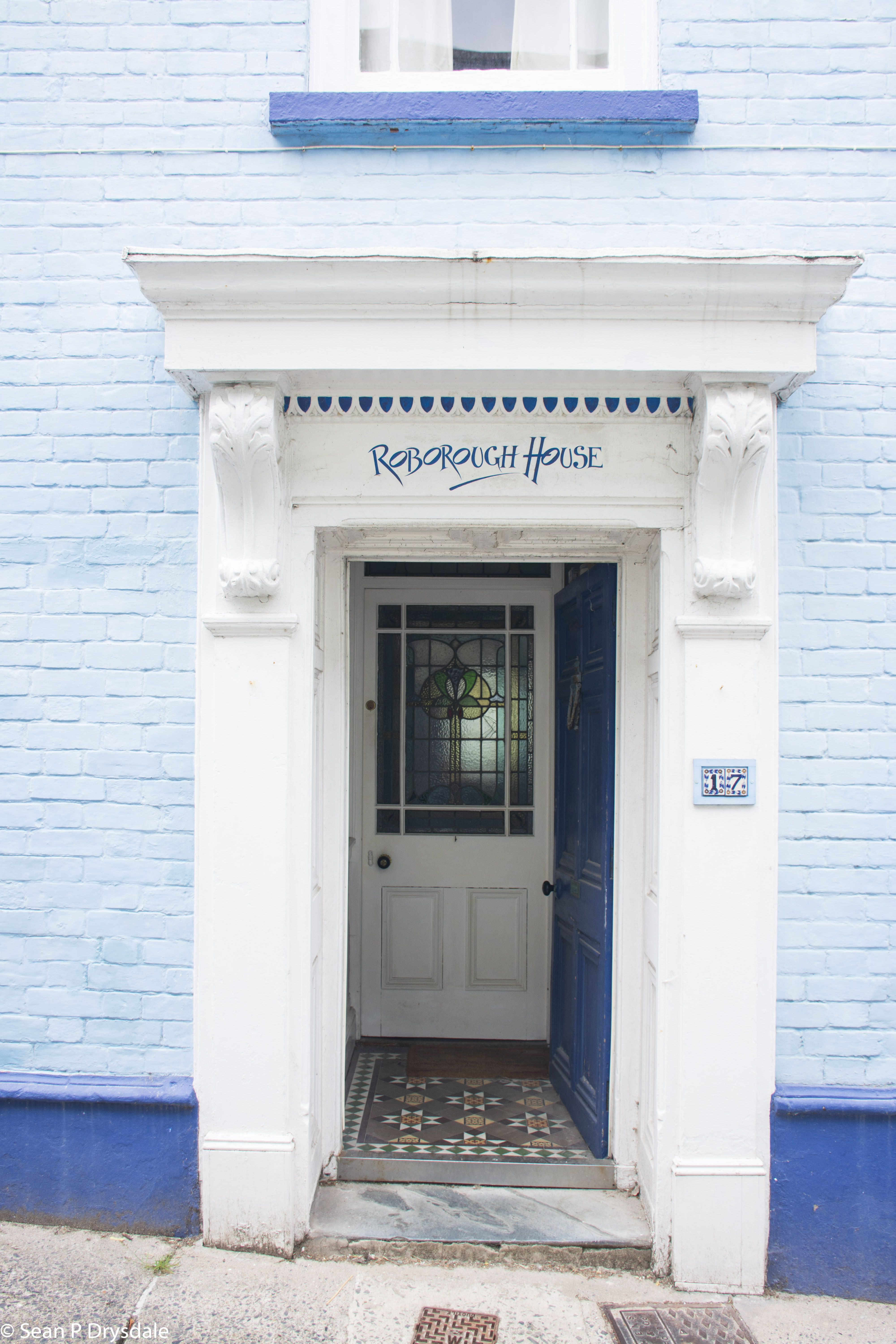
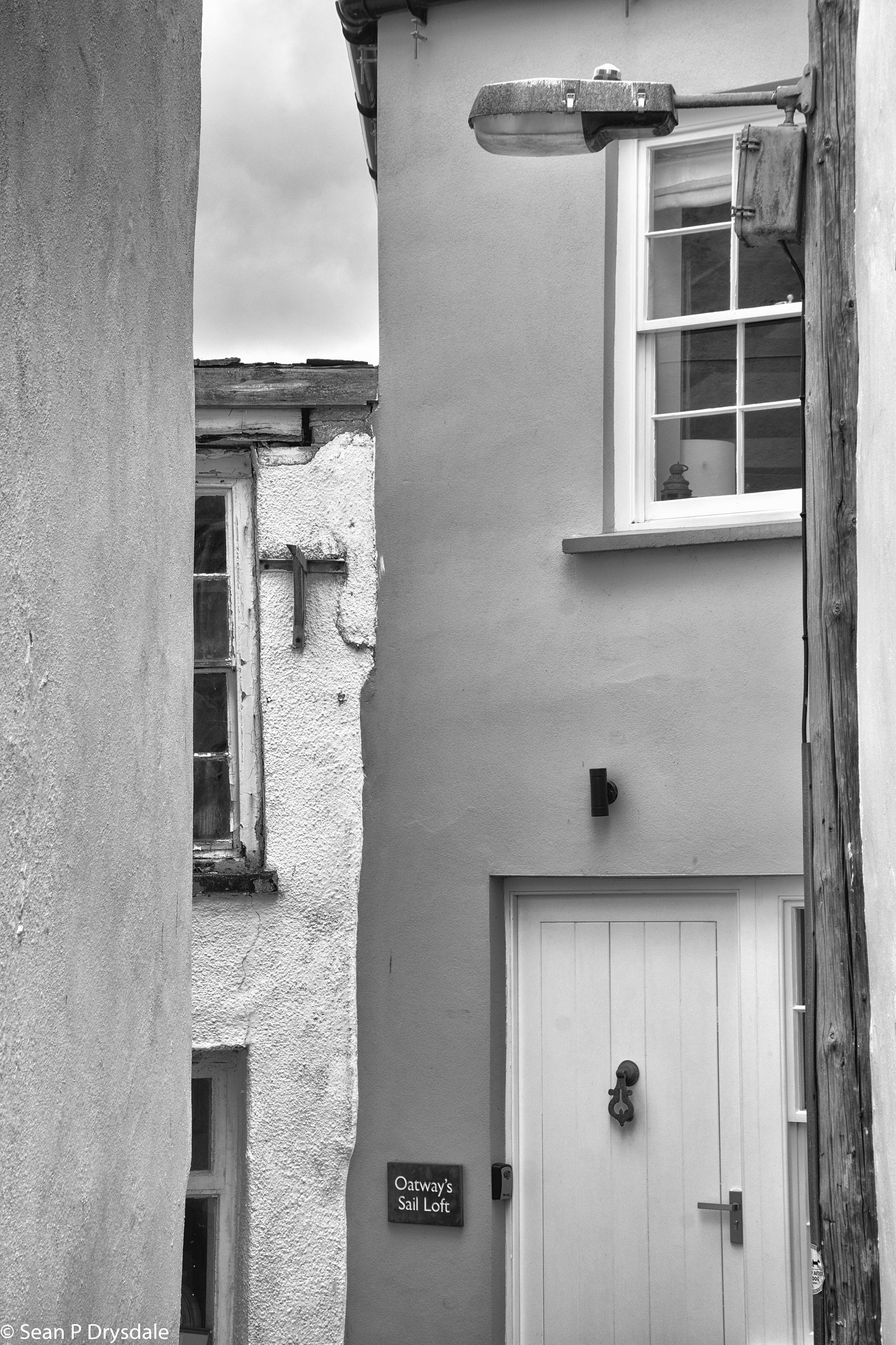
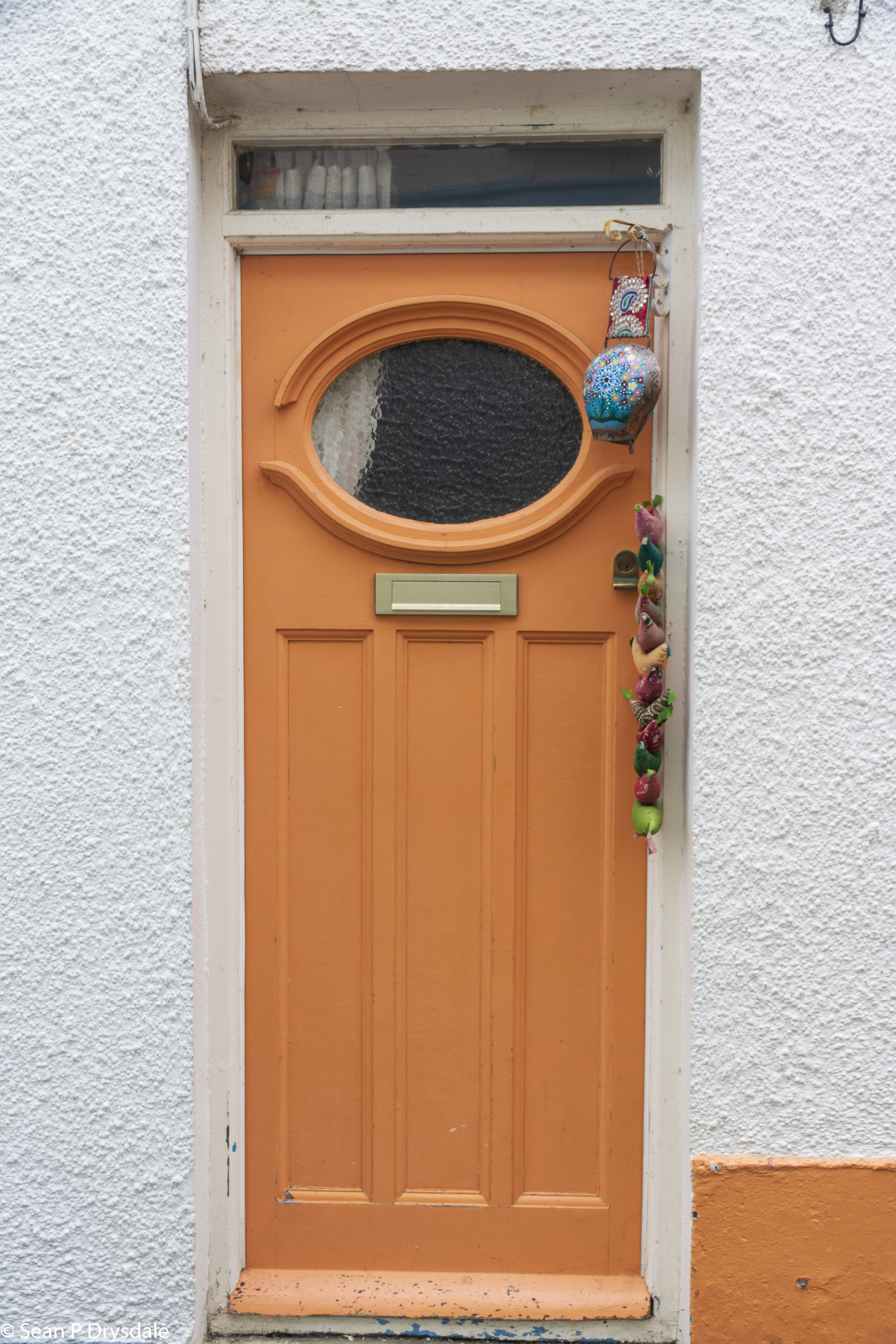
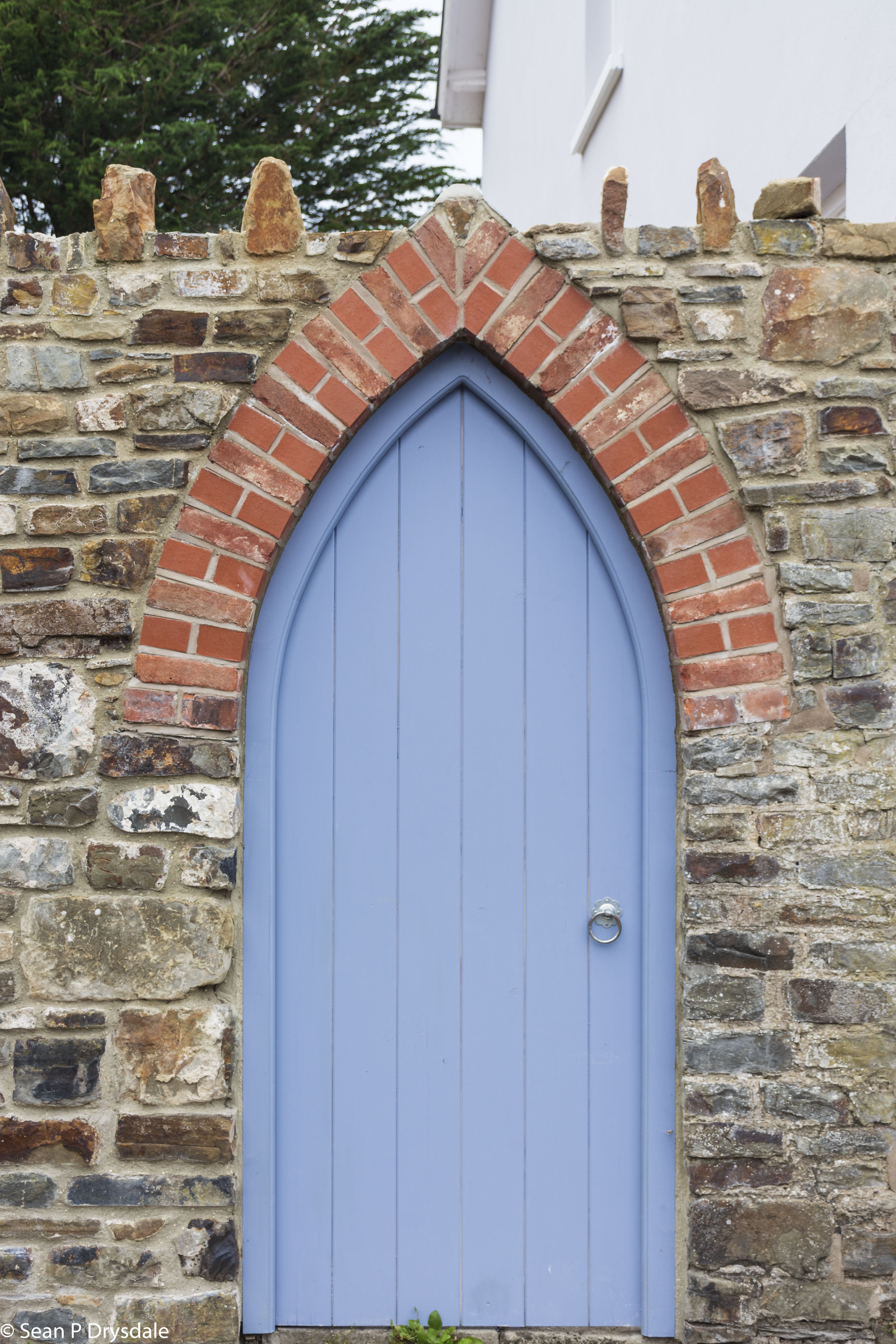
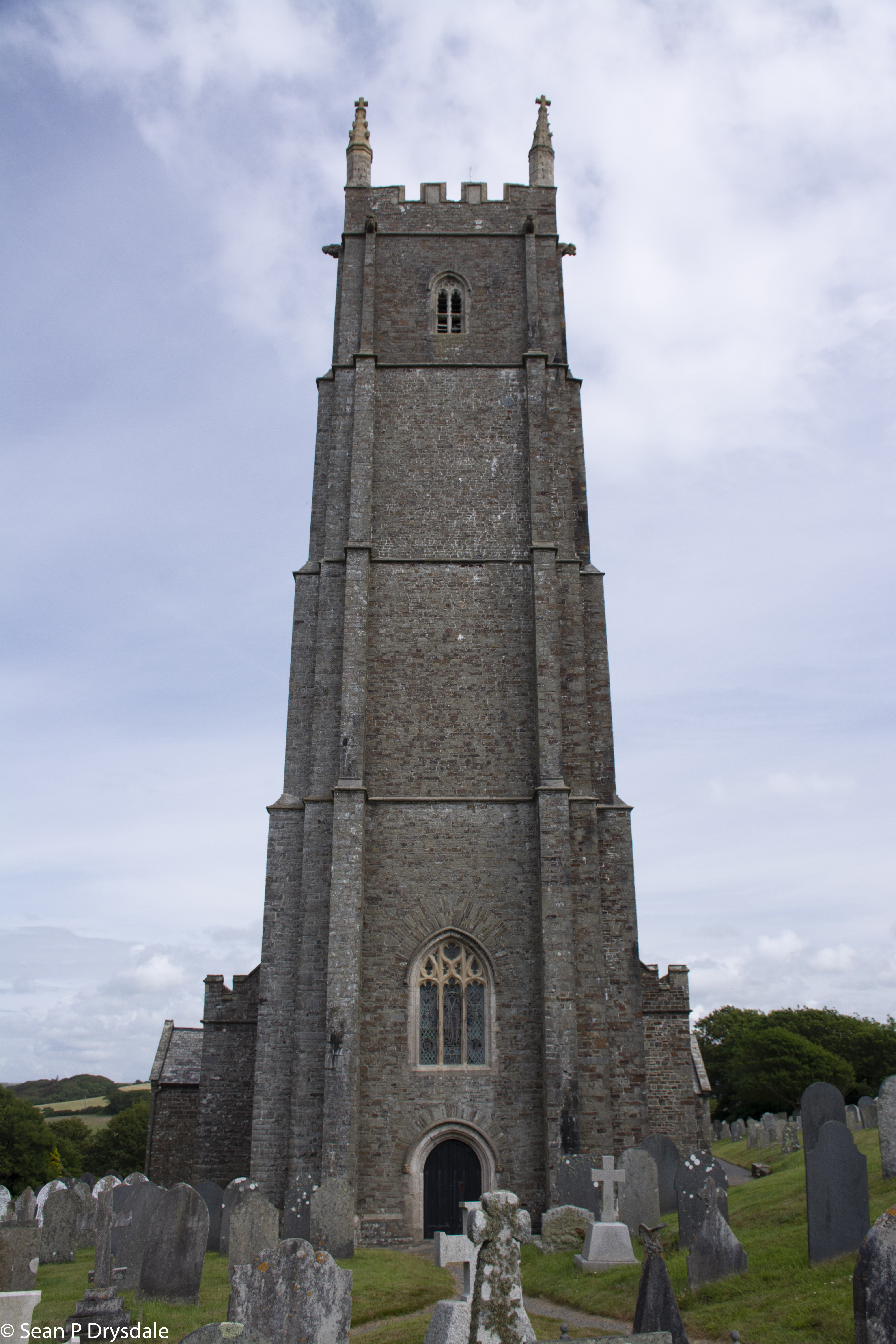
For those from a western (Euro/American) background we read from left to right, and our default starting point for scanning an image / page / screen is from left to right. Our cameras are primarily designed for some sort of landscape format. All three of the above observations contribute to how we make our images. But, every once a while the scene says “make me vertical”. Today’s collection is a response to that voice.
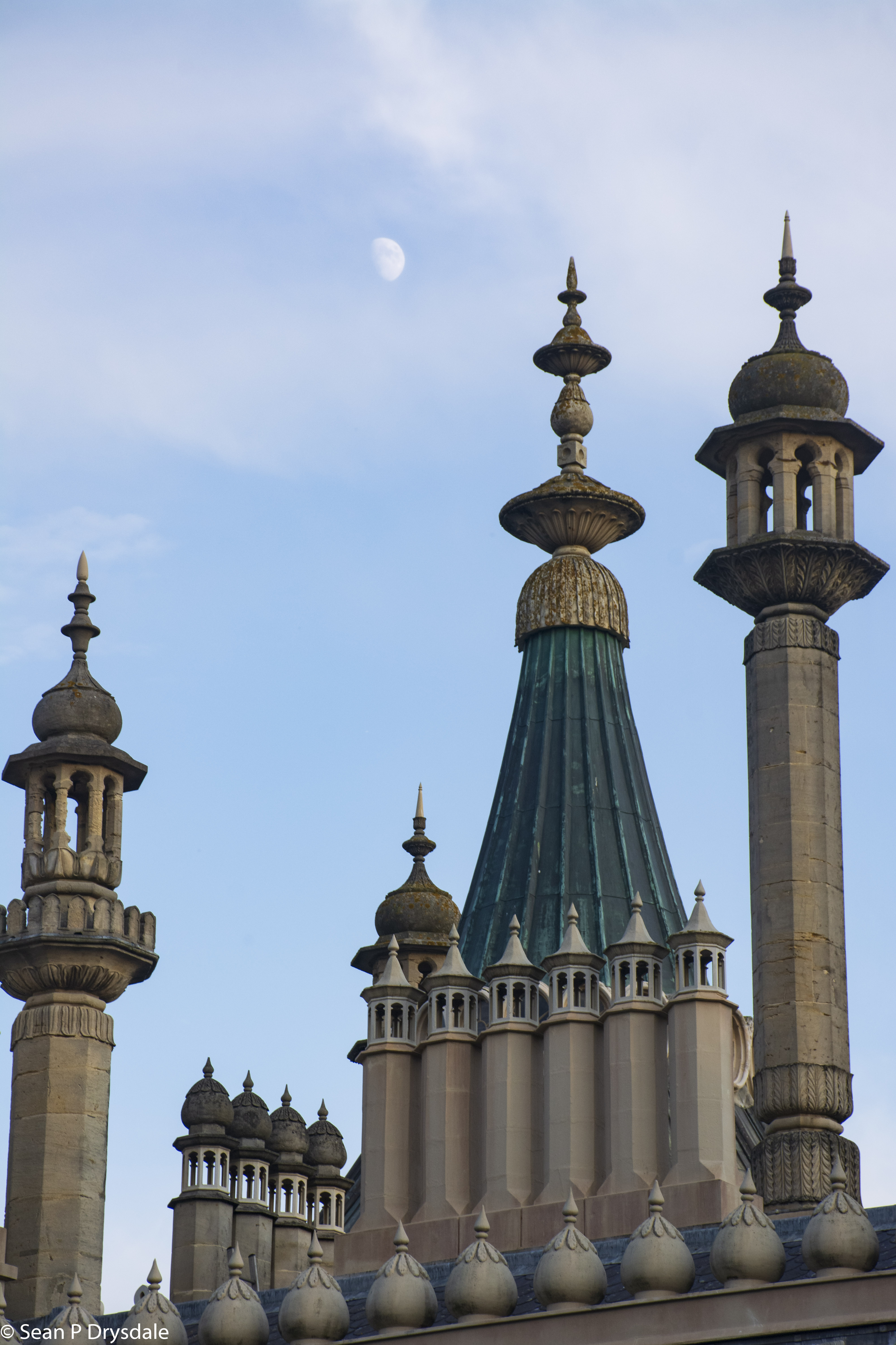
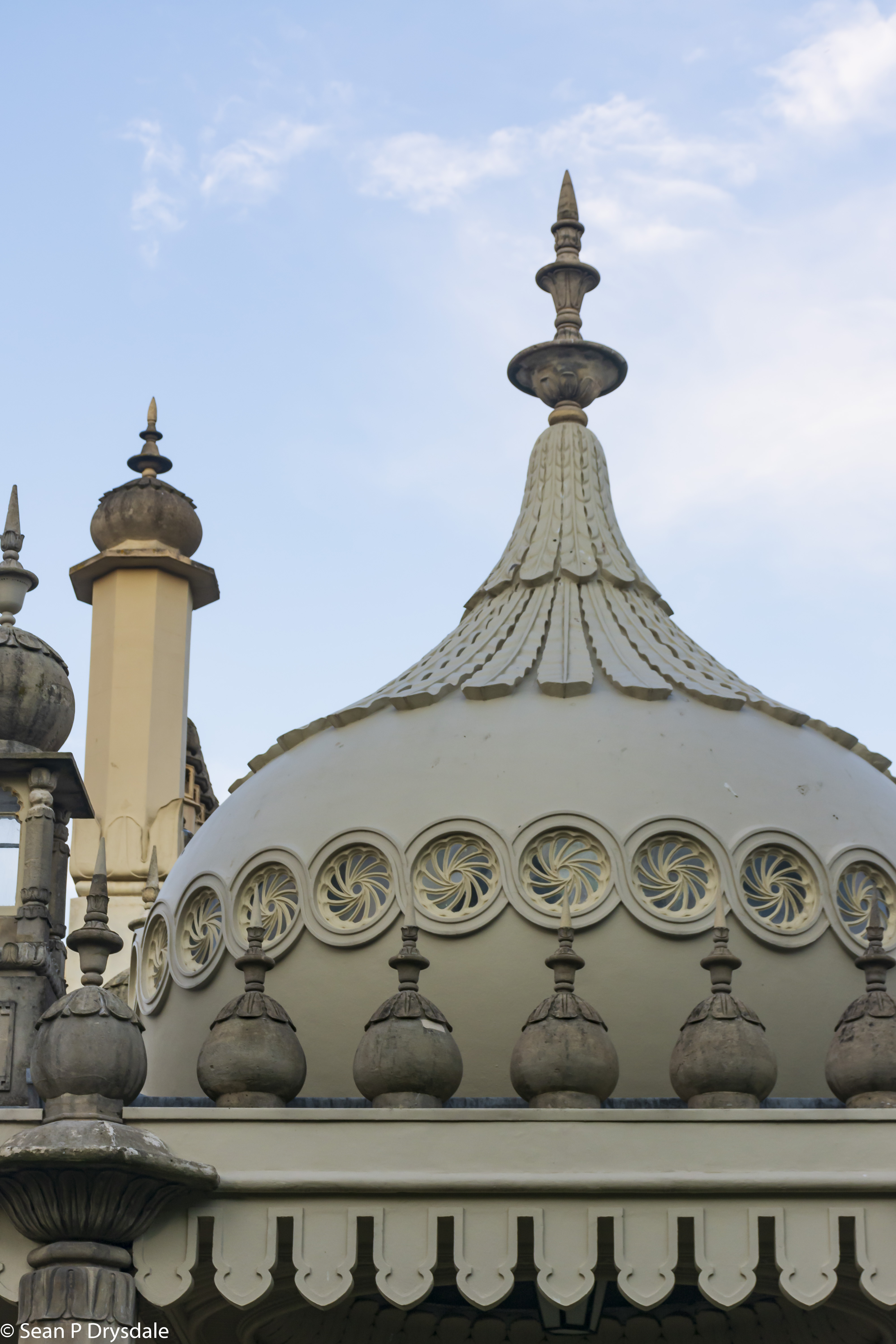
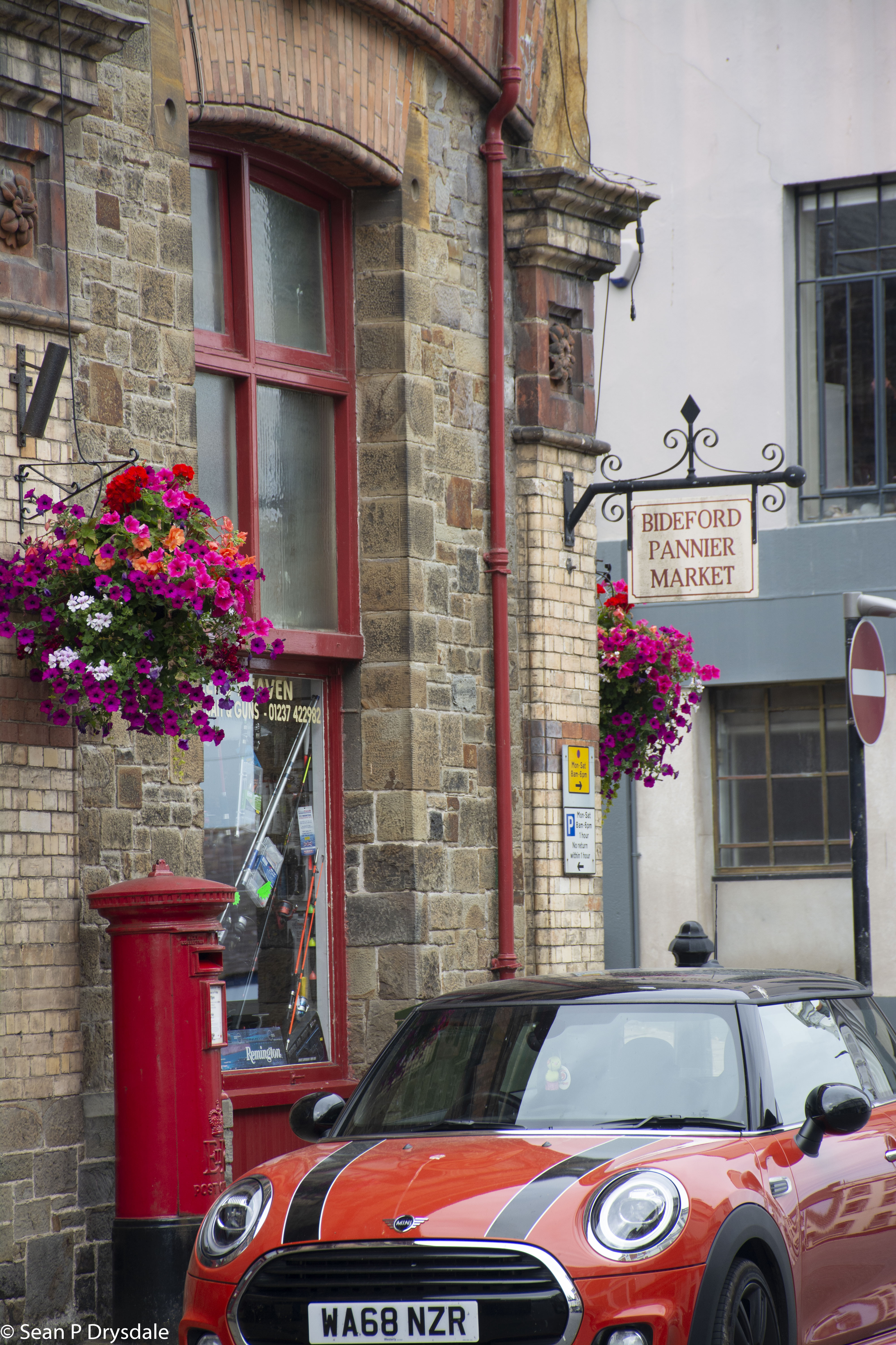
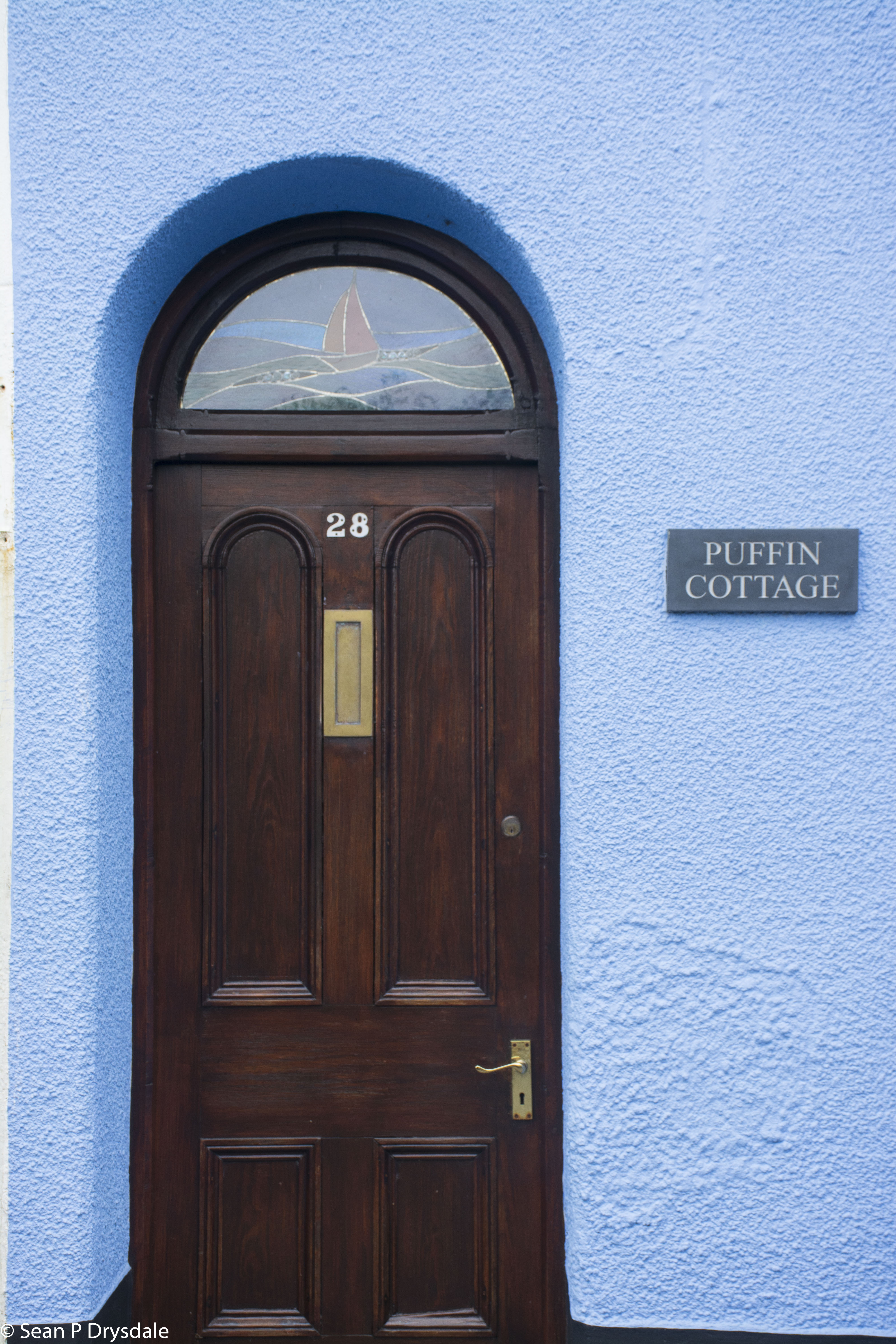
King George IV (British monarch from 1820 to 130) led a lavish lifestyle. He had John Nash, the architect also known for Buckingham Palace and Marble Arch, enlarge and redesign an existing building. That building became Brighton’s Royal Pavilion. Today’s first two photos are details of that pavilion. The remainder are from north Devon towns and villages.
As and aside and according to Wikipedia, the formal Regency period refers to the time George IV was on the throne. The Regency era refers to the years from 1795 to 1837.
As always, I look forward to your comments.
Cheers, Sean
Reading on the desktop screen.
Without the moon, that first one would be kind of dull. I struggle with the laws of perspective, and the difference between what our brain sees when we look up at buildings, and what the camera sees.
2 strikes me as one of my shots, either not close enough or not far enough away. I love the iris windows, and the leaves on the central building, but all the stuff on the left seems to be clutter to me.
I see why you took #4, and I am amused.
I’m in love with the textures in 6. Pity about the modern street light, but it has some interest of it’s own.
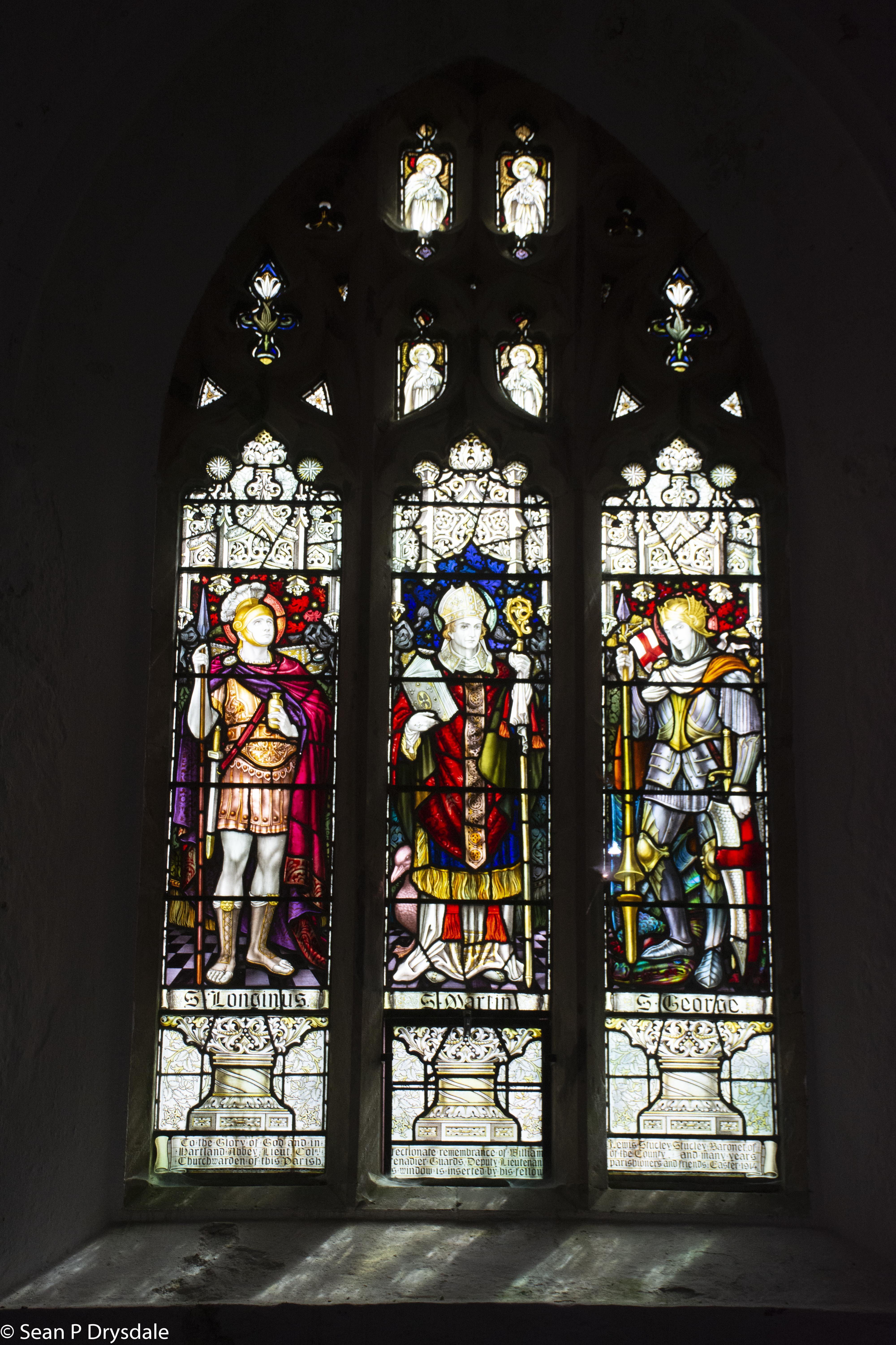
I’ve tried some stained glass shots, and have usually been disappointed in the difference between what my brain and what the camera sees. You’ve balanced the light really well, giving a hint of the textures for the surrounding stone.
10 is wonderfully composed!