Dear Reader,
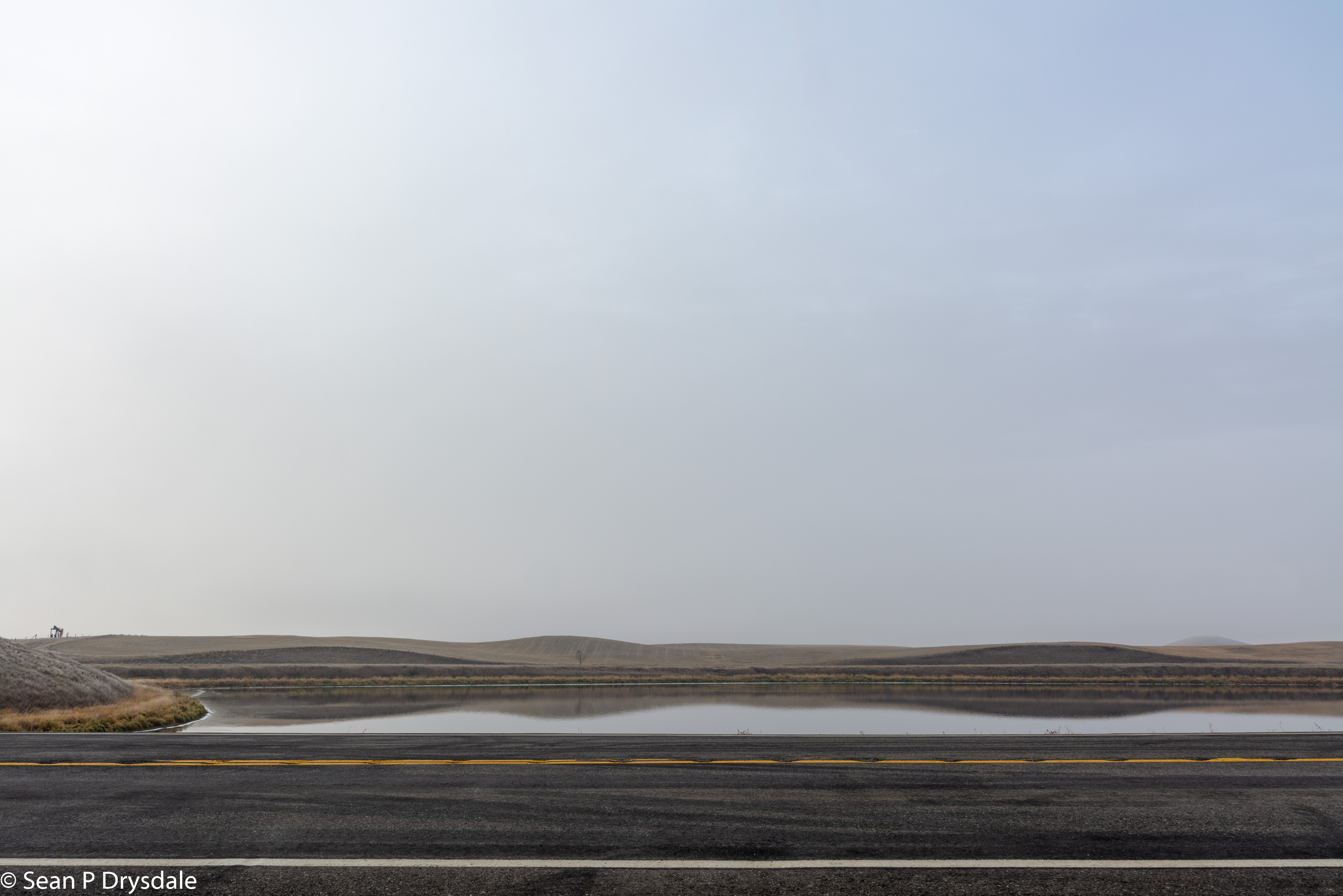
I have yet to share this photo from early November. On the Sean scale this is a five. It is a photo I have returned to off and on over the past month or so. I am so very pleased with it. Whether you are indifferent , love, or hate it, I would love to know. PS It looks better large.
Cheers, Sean

Small, as in seen on a filthy laptop screen late at night, I was meh.
Today, post-coffee, and warming up with some image editing of my own, I returned. I’m now looking at it on the Mac screen (which has more filth issues than I like to admit), with the image 18 inches wide by 12 inches tall. So much better.
You and I often disagree about where the horizon should be placed, and this is another one. I like the sense of space in the sky, with the subtle gradation from white to a blue grey. The horizon is about 3.5 inches up from the bottom as I look at it now, and there’s lots to look at along it and below it. While I’m uncertain where my final image proportions would end up, I’d certainly have tried a 16×9 crop to see how it looked, and maybe, maybe, would have tried a 3×1 ratio, just to see how it looked. I’ve been holding a ruler against the screen and trying to get a sense of it. I’m pretty sure the 3×1 is too little sky.
Then again, I’m fond of panorama shots that are much wider than they are tall. Then I thought about it as a print, especially if it was hung a little higher than normal. That might work really well.
I would say, do not remove the weeds. They give the eye some interest as it follows the line of the road edge. Without them, I think the eye would slide across the page at ever increasing speed, to bang into the other side. There are some interesting textures in the road, and on the hills that I like.
I hope whoever prints this is up for the challenge.
As always, thank you for visiting and your comments. Once upon a time I was more inclined to go for 20 – 25% land. It is funny you measured it, because I consciously placed the horizon line below the 1/3 mark and on reflection the 1/4 mark seemed too low. Resolve will be the printer. My question is about who will print it, but on what paper. I am thinking of printing the set of “RA” and “Thin Line” sets on matte paper.
I like the vastness depicted in this photo. It’s so typical of the prairies. My eye is drawn to the yellow line on the road, and I find that a pleasing element. I like that the pumpjack adds an element of interest on the horizon. I don’t see any distracting elements, with the possible exception of some weeds at the edge of the road. They are emphasized by the water in the background. Should these be removed in Lightroom/other? I’m not sure. Overall, I really like this photo. I like the colors as well.
Thank you for visiting and your comment. I hummed and I hawed about removing the weeds. In the end I kept them in. It is though worth a look to see what the image would be like without the weeds.