Dear Reader (posted 2023-04-05),
The White Over Red Forward and Table of Contents can be found here.

Despite what the rabbit says, I am not late, I just wasn’t ready. In between completing last year’s walk through the French Alps and beginning the Time Frame project, I looked at the photos of that walk. All the photos from those 6 +1 weeks of travelling were various shades of dreck. Some were less dreckier than others, but they were all mostly dreck. Furthermore, it was pretty obvious that I didn’t really know how to capture an image at all. Time has past. I have looked at the collection again. Some of those really drecky images are actually quite good, and so the self-doubts have been laid to rest for at least a week or two.
As well, there will soon be new paths to walk, and that too is encouraging me to capture yesterday’s tales today.
So, we are back to White Over Red for at least a little while and at idiosyncratic intervals. Just to remind you that we are not in Kansas, here is a quartet of images from Lausanne and Evian.
You are welcome to share a link to this page with others.
As always, all comments are welcome and sought.
Cheers, Sean
My note on privacy can be found under the “About” menu item, and if you would like to subscribe to this blog please enter your email.
.
All rights for all material on any media reserved – © Sean P Drysdale 2017-2025
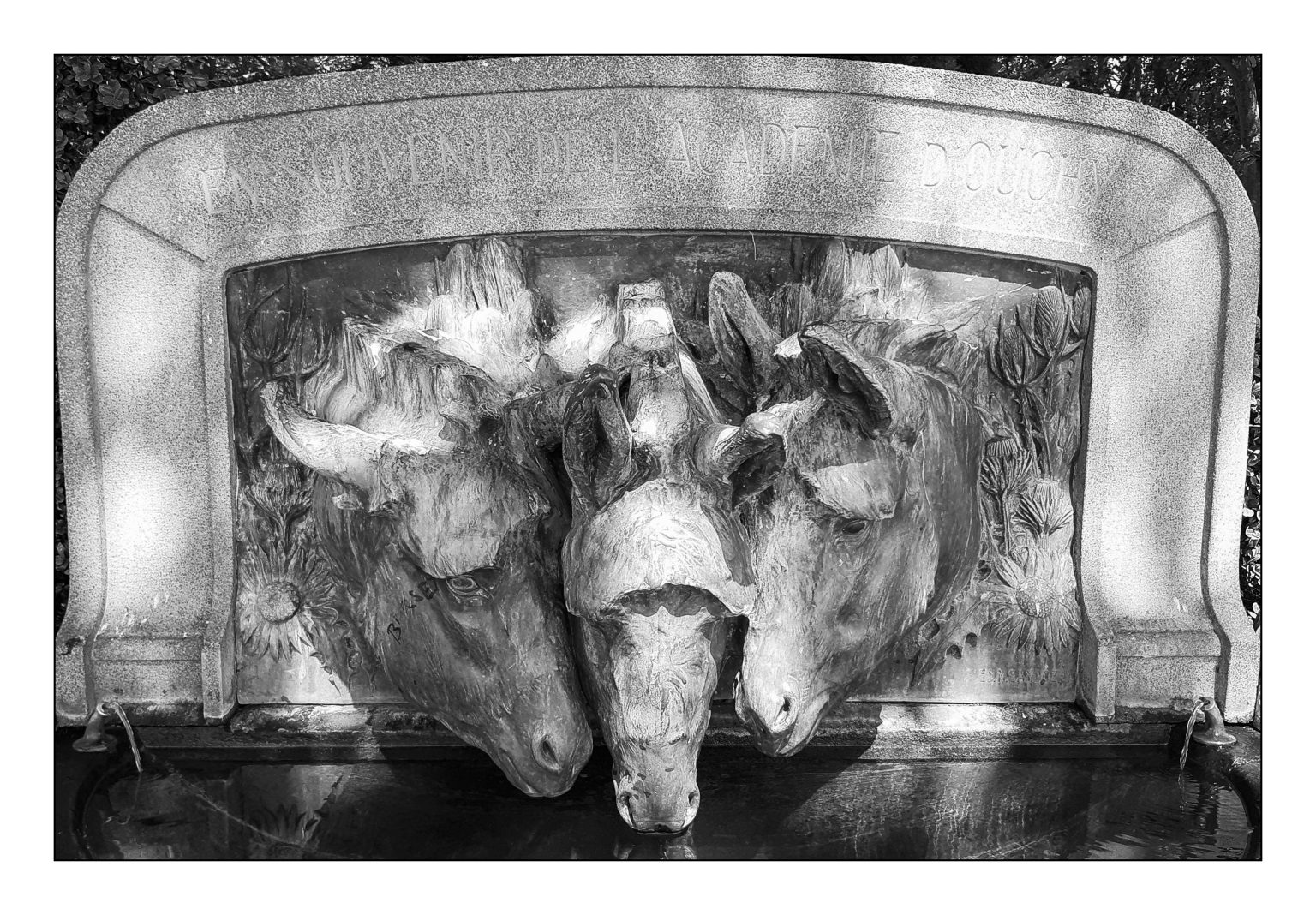
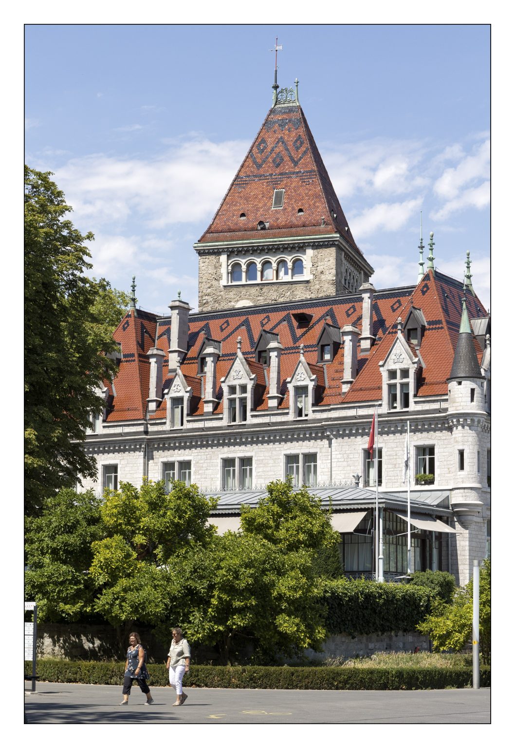
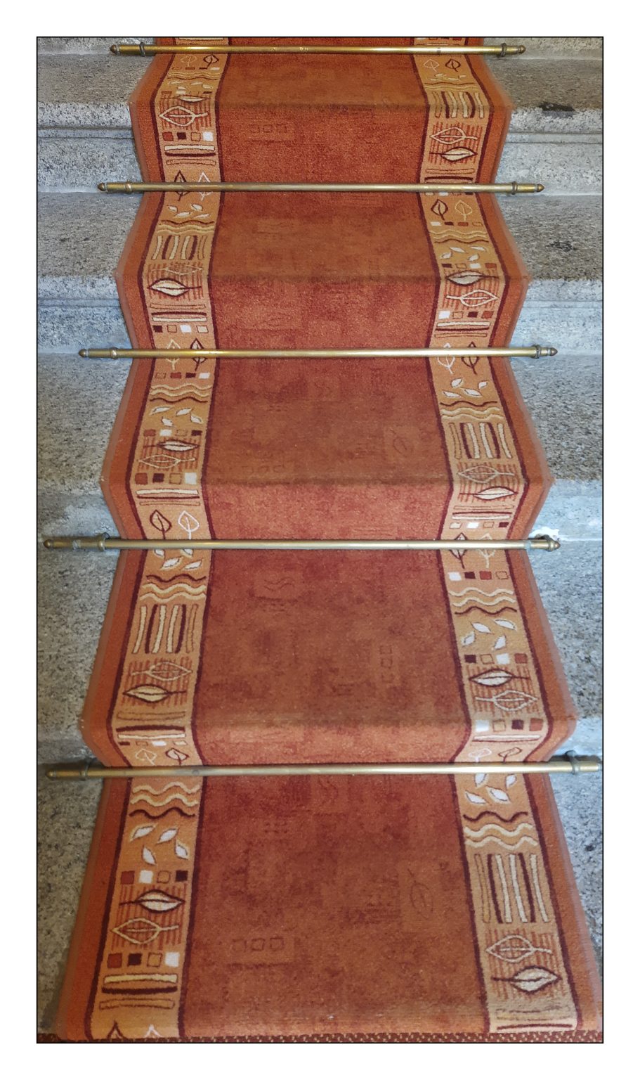
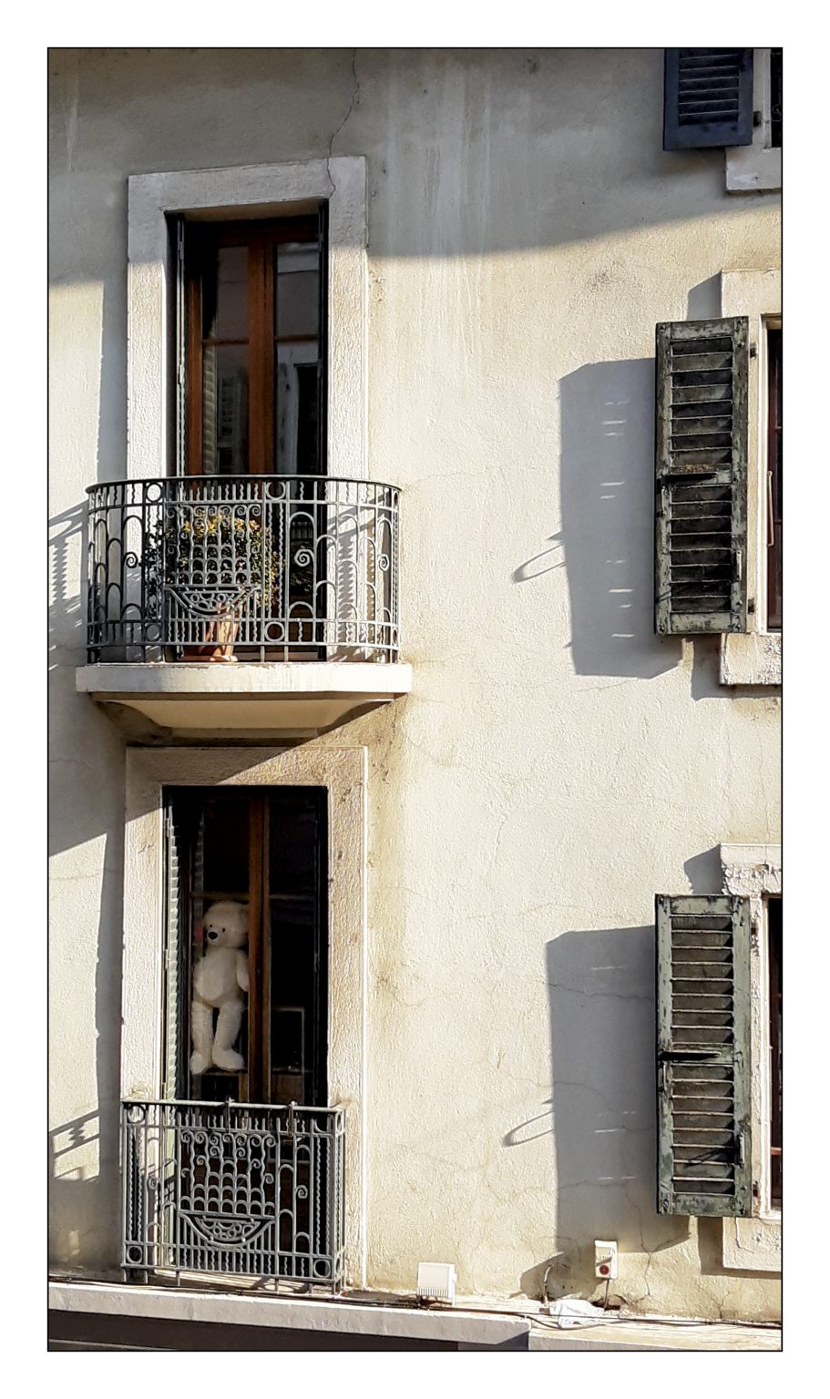
There has been any number of times I’ve looked at a photo and wondered what I’d been thinking when I clicked the shutter. But happily, there are times its been the opposite, capturing a scene while thinking nothing in particular of it, and then discovering it’s surprisingly good.
If I’m to believe Lightroom I’ve at least partially edited about 25,000 photos, and days I wonder if I’m any better at it than when I started. I think it’s natural to doubt oneself periodically, wondering if you actually know how to make a good photo. I tell myself it’s part of the growth process, that what was once good is no longer seen as such because the standards have changed.
1. This is quite delightful! I love the textures and sense of depth. I think this would be a lovely print.
2. If this was a drawing for a test on perspective, the artist would fail because those roof lines are all messed up. That is, assuming that the building was built square, and I’m guessing the tower is not actually square to the rest of it. Maybe it’s another building entirely. Maybe the builders had a bad day when laying out the foundations and didn’t want to redo it. And why would someone go to the trouble of building such a tower, and then make the roof in such a fashion that there is no place to stand on top and look out over the world? Oops, something shiny, now, where was I again?
3. Baffled.
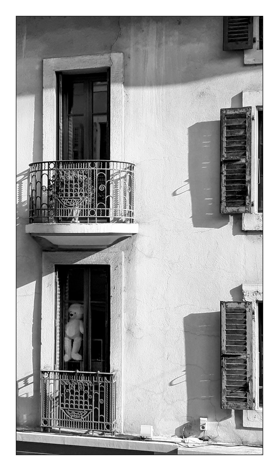
4. I’m kind of struck by the textures and shadows of the wall. But really, the contrast between the serenity of the top window, and that creepy teddy bear peering out of the bottom one is a bit unnerving.
Keith thank you for the quality control on the site, and commenting. One of the benefits of distance, is that I can separate the image from the event. The image then has a chance to stand or fail on its own merits. I have added a b&w of the teddy bear, and I think the image is even more unsettling in b&w.